Learn how RoxOpt’s personalized HYROX race pace analysis helps you understand pacing, avoid blowups, and improve your training strategy. See what your performance truly reveals.
How to Interpret Your HYROX Race Pace with RoxOpt
HYROX is not a linear race. It’s a complex sequence of eight different stations, each with varying demands and time requirements and every athlete brings a unique mix of strengths and weaknesses. Just because two athletes arrive at the same point in a race at the same time doesn’t mean they’re on track for the same finish. One may be hitting their limit, while the other is just getting started.
That’s why a smarter, more personalized approach to pacing is essential. Calculating a race pace that’s actually useful for refining your training and race-day strategy requires context - not just a stopwatch.
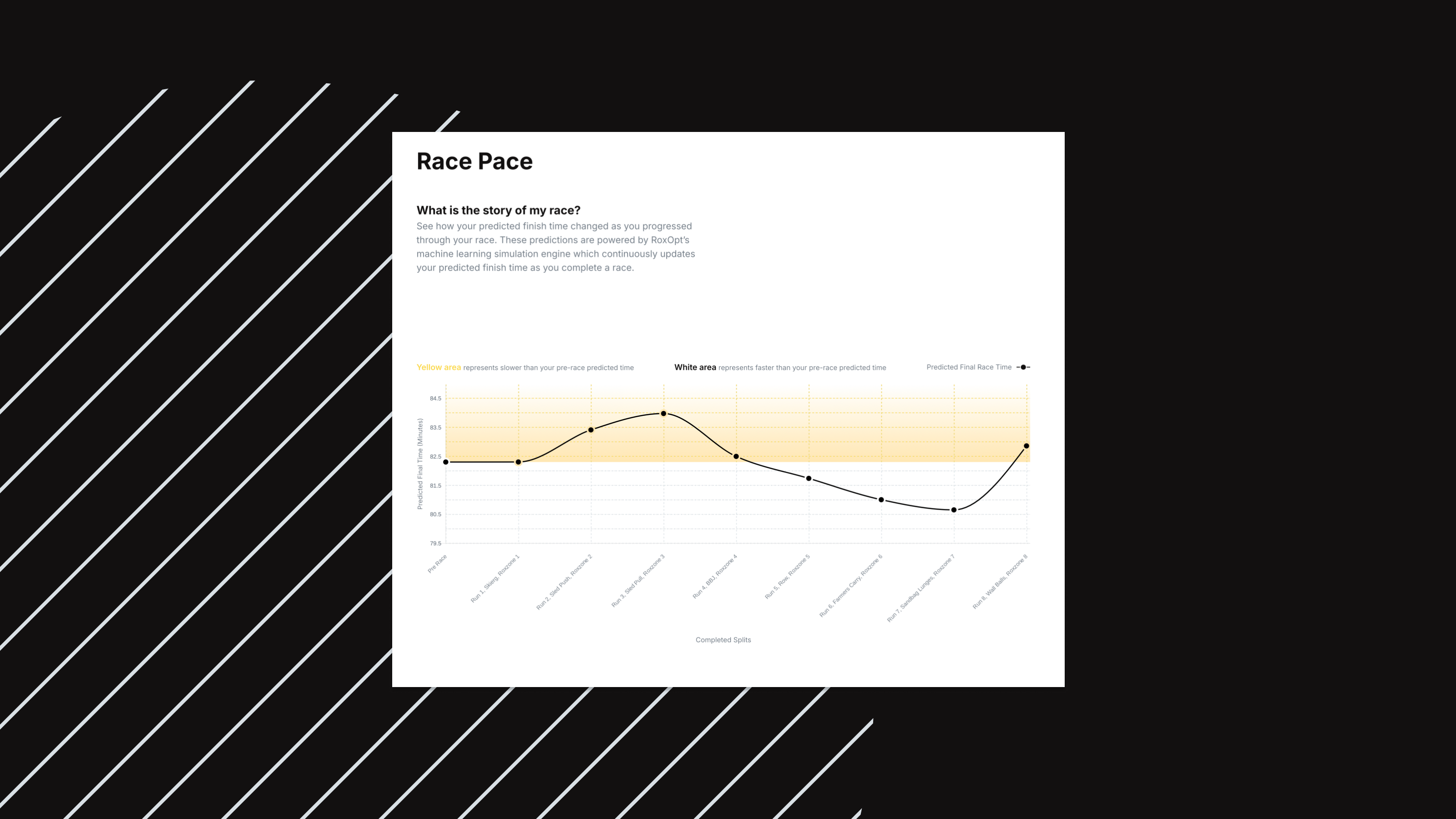
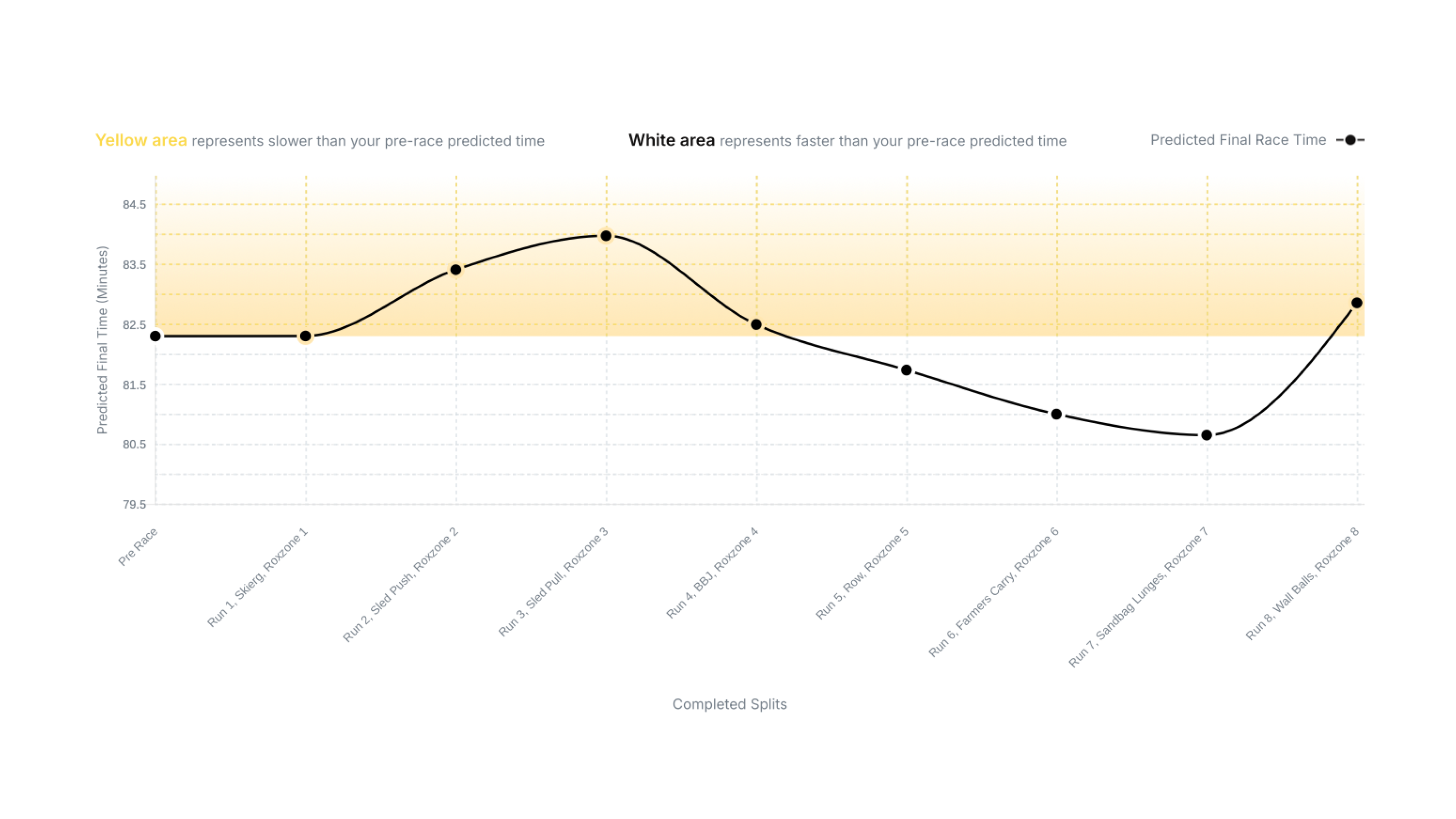
Inside every RoxOpt Race Performance Report, you’ll find a visual breakdown of your Race Pace, a tool designed to tell the story of your race in just a few seconds. Powered by RoxOpt’s machine learning simulation engine, it shows not just how you performed, but how your pacing unfolded over time.
At the core of this feature is your predicted finish time, which updates dynamically as you progress through the race. Unlike basic pace charts that assume all athletes move the same, RoxOpt’s approach is personalized and grounded in your unique race history.
Why Context Matters in HYROX Pacing
Let’s look at a common scenario.
Imagine two HYROX athletes exit the SkiErg at the exact same time — 6 minutes and 30 seconds into the race. A basic pacing model might say they’re on pace for the same finish time.
But here’s what’s missing: context.
Let’s say Athlete A is an Elite 15 competitor with a personal best of 55:07, cruising at a controlled effort. Athlete B has a personal best of 1:20:05 and just went deep into zone 5 during the SkiErg. Clearly, they are not on pace for the same finish even though the clock says otherwise.
That’s where RoxOpt comes in. Our pacing model factors in historical performance and energy system modeling to provide a far more accurate picture of what your actual race pace means.
What the Graph Tells You
On your race pace chart, you’ll see:
- A horizontal line representing your predicted finish time before the race began
- A moving line that adjusts your expected finish time as you progress
This lets you quickly answer:
Did you pace your race well, or did things fall apart?
If your projected finish time steadily improves, it’s a sign of a well-managed effort, often leading to a personal best. But if you surge ahead early only to see your projection spike dramatically later on, it likely indicates a pacing issue or a lack of aerobic capacity.

What It’s Really For
RoxOpt isn’t trying to predict your finish time to the second. The goal is to provide a clear, data-backed pacing baseline that helps you:
- Understand if you went out too hot
- Identify where things started to unravel
- See how well you recovered mid-race
- Adjust your training and race strategy accordingly
Every athlete blows up at some point. The key is learning why and making the next race smarter.
Curious how your last race played out?
Check out the Race Pace section of your RoxOpt report and start planning your next training block with confidence.


